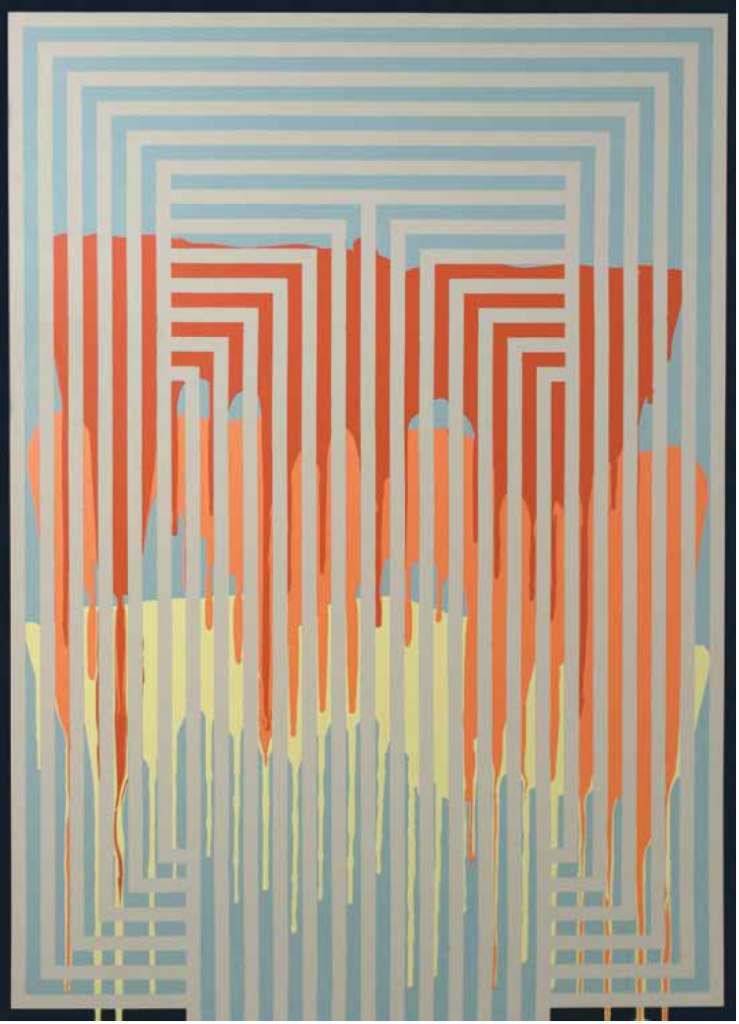
Andrew Cairns and Benjamin Woodyard, Big Drip , 2014. 1. 7 x 1. 2 m.
Photo: Sam Stewart
Andrew Cairns doesn’t so much paint, as reveal. In a body of work spanning 60 plus paintings over five years, Cairns experiments with colour and line as his own Op Art revival.
Propelled by the interplay of pigments and rooted in process, Cairns’ large-scale, geometric pieces are inspired by a deep love of quilts. His decorative abstractions are in contrast to the usual mode of Maritimes’ landscapes, while celebrating a visual style influenced by local craft tradition. Taking instinctual action, Cairns’ work honours memory through the contrast of bold, modern expressions.
“You learn a lot from limiting the possibilities. I look at the canvas as a problem I’m trying to solve in a visual way.” -ANDREW CAIRNS
“Initially, I felt I was doing something that others weren’t and it helped it stand out a bit,” says Cairns. Experimenting with drawing, printmaking, photography and video, Cairns, “stumbled on” the method of using tape on his canvasses while painting. “I use tape as a resist, which is fabric term,” he explains. “The tape stops other colours from going on certain parts of the fabric.” He adds that making the patterns fit into one inch boundaries “without being boring is a challenge, but then the colours are very intuitive.”
“It has been quite a learning curve figuring out what colours do what together. Some colours look so good together,” says Cairns.
“The process is kind of funny because I’ll put the tape down, then the different colours, and I won’t really know what the final product is going to look like until I take the tape off.”
The artist compares his work to that of post-painterly minimalist Frank Stella: “But I don’t even know if I had really seen Stella before I did the first painting in his style,” he says, musing that Stella’s look has simply seeped into popular culture. “I’ve been drawn to the 1970s in general and the aesthetic of that time. I think it fits well with how I feel about making work.”
“I want to offer a body of work in a uniform style, to define what I’m doing. In pushing a very specific output, I’m freer to deviate,” says Cairns. “You learn a lot from limiting the possibilities. I look at the canvas as a problem I’m trying to solve in a visual way.”

Andrew Cairns, Lo-Deco, 2015. Acrylic on canvas, 1. 4 x . 9 m.
Cairns describes his work as communicating at the level of direct visual appeal. “It’s a bit optical but not overwhelming, as some Op Art can be quite hard on the eyes,” he says. “But working big, often six feet by six feet, taping, is a nice way to tackle a large space without it being too much. The result is pretty clean but also maze-like.”
Over fields of contrasting colours and shapes, Cairns work is informed by textiles and handicraft. “I’ve always really liked quilts. Some of my early stuff really intentionally mimicked the look of quilts,” says Cairns. “It can be powerful and provocative to bring decoration in. It’s unexpected and not always seen as high fine art. I know some people can feel like it’s a slippery slope, but I don’t feel that way.”
He acknowledges the unique challenges of being a Maritime artist, based on PEI: “In my experience, being an artist in the Maritimes seems like such an untenable position sometimes—who you’re going to sell work to, where you’re going to show—whereas it seems like you can make a valid argument about doing design.”
His work spans the past and present, pointing to the tension between the exalted and ordinary. Sentiment and impulse drive Carins’ hypnotizing monuments. “They’re fairly open to whatever people want to read into them. They’re a space for projection.”


Leave a Reply