Entrance Gallery
Ronald Bloore
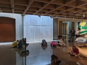
In 1965, painter Ronald Bloore offered to create a custom mural for the newly built Confederation Centre of the Arts. The mural was completed in 1967 and is comprised of 11 Masonite panels with layers of white oil paint ranging from cool to warm whites, flat to glossy finishes, and smooth to highly textured surfaces. The varying tones and textures, coupled with the changing outside light, create a mural that Bloore felt would “always be alive and moving.”
The conservation of the mural was carried out in 2018 by Elizabeth Jablonski, a paintings conservator from Nova Scotia, with assistance from Confederation Centre Art Gallery’s conservation technician, Jill McRae. Cracks and losses were consolidated; spot testing was conducted to formulate an appropriate cleaning solution, and areas that could not be safely cleaned were coated with an archival resin and inpainted to match the colour and gloss of the surrounding original paint.
The mural was reinstalled in May 2019 and once again it interacts with the architecture and light, “reflecting something of the outside into the interior.” The changing, raking light provided by the skylight throws Bloore’s welt-like lines and textured planes into sharp relief, presenting White on White in its best light.
Paul Griffin
The conceptual and physical challenge of Leviathan was to combine a natural element, a large, heavy, forked, elm trunk, with an industrial material—specifically galvanized roofing nails—to create what the artist described as “a hybrid of a sort; an organic machine.” The title, Leviathan, came on completion of the work and alludes to the fearsome sea creature mentioned in the Bible (Job 41). Can a galvanized tree embody both the beauty of nature and our conflicted impact on ecosystems?
Eleanor King
Eleanor King’s monumental wall paintings combine various visual sources and rhetorics. Derived initially from Google satellite views, their subject is how we relate to the land, to its occupation, use and history, how we control, survey and understand the patterns on its surface. With Emerald, she translates the site of rural Prince Edward Island into a hard-edged abstract painting. King’s choice of paint colours is based both on aesthetic decisions and their brand titles, which allude to the commodification of culture, and the historical and political realities that underlie how we visualize the land.

